BrandPilot v2
Design system brandpilot · v1.0.0 · published 15/03/2026
BrandPilot's token system is built around a dark-mode-first, intelligence-forward aesthetic that is simultaneously premium and approachable. Here are the key design decisions:
The primary hue is deep indigo-violet (hsl 242, 88%, 69%) — chosen over generic SaaS blue (#2563EB) to feel distinctive and premium.
The slightly warm-shifted dark base (hsl 230, 22%, 8%) rather than pure black (#000) prevents the cold/clinical failure mode and makes the indigo primary feel cohesive rather than floating.
Warm amber (hsl 38, 91%, 55%) serves as the accent, appearing in hover states, data visualization, and warning indicators — it provides the warmth balance called out in the brief without competing with the primary.
Rose-violet (hsl 270, 88%, 72%) is reserved for the fourth chart color and AI processing state differentiation.
All 17 contrast checks are validated against dark mode first. The neutral scale (950→50) maps directly to the dark surface hierarchy: 950 is the base background, 900 is muted, 800 is borders, descending to 50 for near-white foreground text.
This creates a coherent, mathematically consistent elevation system.
Space Grotesk (headings) signals technical sophistication and design-tool credibility — used by Linear, Loom, and premium SaaS tools. Its distinctive character at display sizes creates strong visual hierarchy for pipeline stage headers.
Manrope (body) provides geometric warmth at small sizes, essential for data tables and dense dashboard layouts. JetBrains Mono is the third face for token values, API keys, and code snippets — critical for the technical credibility expected by agency leads and integration users.
All spacing values are strict multiples of 4px/8px. Comfortable density defaults: 24px card padding, 32px section gaps, 12px table row padding (compact), 16px sidebar horizontal padding. No arbitrary values permitted.
8px for cards/inputs, 6px for buttons, 4px for badges, 12px for modals. This signals modern SaaS approachability without the softness of pill shapes — appropriate for a professional tool targeting agencies and brand managers.
All shadows use rgba(10, 8, 30, x) — a dark-tinted indigo rather than pure black — to maintain palette cohesion across elevation levels. The four-level system (flat → subtle → raised → floating) maps directly to the glassmorphism guidelines: floating level is reserved for modals and toasts.
Every CSS custom property is defined in HSL format without the hsl() wrapper, enabling the shadcn/ui pattern of `hsl(var(--primary))`. This allows BrandPilot's own UI to be the proof-of-concept for the token system it generates — the most powerful trust signal for agency and brand manager users.

BrandPilot Logo Icon
logo icon · 1024×1024

BrandPilot Logo Light
logo icon · iconLight · 512×512

BrandPilot Logo Dark
logo icon · iconDark · 512×512

BrandPilot Logo Monochrome
logo icon · iconMono · 512×512
BrandPilot Logo Reversed
logo icon · iconReversed · 512×512

BrandPilot Wordmark
logo wordmark · wordmark · 1024×256

BrandPilot Wordmark Light
logo wordmark · wordmarkLight · 1024×256

BrandPilot Wordmark Dark
logo wordmark · wordmarkDark · 1024×256

BrandPilot Wordmark Monochrome
logo wordmark · wordmarkMono · 1024×256

BrandPilot Horizontal
logo horizontal · horizontal · 1536×512

BrandPilot Horizontal Light
logo horizontal · horizontalLight · 1536×512

BrandPilot Horizontal Dark
logo horizontal · horizontalDark · 1536×512

BrandPilot Horizontal Monochrome
logo horizontal · horizontalMono · 1536×512

brandpilot-favicon
favicon · 32×32
--color-accent
#F5A623 / #F5A623
Warm amber accent — hover states, highlights, data viz warmth
--color-accent-foreground
#0E0F17 / #0E0F17
Text on amber accent backgrounds
--color-background
#0E0F17 / #0E0F17
Base page background — dark mode primary surface
--color-border
#252838 / #252838
Default border color for cards, inputs, dividers
--color-card
#14151F / #14151F
Card and panel surface — slightly elevated from background
--color-card-foreground
#EDEEF5 / #EDEEF5
Text on card surfaces
--color-destructive
#EF4444 / #EF4444
Error and destructive action color
--color-destructive-foreground
#FFFFFF / #FFFFFF
Text on destructive/error color backgrounds
--color-foreground
#EDEEF5 / #EDEEF5
Primary text color on dark backgrounds
--color-input
#1E2030 / #1E2030
Input field background color
--color-light-background
#F7F8FC
Light mode page background
--color-light-card
#FFFFFF
Light mode card surface
--color-light-foreground
#0E0F17
Light mode primary text
--color-light-primary
#4B4EE8
Light mode primary — slightly darker indigo for AA on white
--color-muted
#191B28 / #191B28
Muted/subdued backgrounds — disabled states, inactive areas
--color-muted-foreground
#8B8FA8 / #8B8FA8
Muted text — captions, placeholders, helper text
--color-popover
#1E2030 / #1E2030
Popover and dropdown background
--color-popover-foreground
#EDEEF5 / #EDEEF5
Text inside popovers and dropdowns
--color-primary
#6B6EF5 / #6B6EF5
Primary brand color — indigo/violet for CTAs, active states, focus rings
--color-primary-foreground
#FFFFFF / #FFFFFF
Text/icons on primary color backgrounds
--color-ring
#6B6EF5 / #6B6EF5
Focus ring color — 2px solid ring with 2px offset
--color-secondary
#1E2030 / #1E2030
Secondary surface — elevated panels, sidebar backgrounds
--color-secondary-foreground
#C5C7D8 / #C5C7D8
Text on secondary surfaces
body
'Manrope', sans-serif
heading
'Space Grotesk', sans-serif
mono
'JetBrains Mono', monospace
Scale
Weights
Line heights
Icon Style
Stroke-based, 1.5px stroke weight, rounded caps and joins, 24×24px base grid with 20px optical size. Icons must be available in two weights: regular (1.5px) for UI actions and bold (2px) for status indicators and empty states. Use Lucide or Phosphor icon libraries for consistency. No filled icons except for active/selected states where fill communicates selection.
Pattern Guidelines
Subtle dot grid or fine diagonal line patterns at 3–5% opacity for large empty surface areas (dashboard backgrounds, empty state panels). Patterns must use the primary indigo color at very low opacity to add texture without competing with content. Animated gradient mesh (indigo to violet, very slow 8s loop) may be used for hero/landing contexts only — never in the application dashboard.
Photographic Style
Not applicable as primary UI imagery. If used in marketing contexts or case study thumbnails within the app: desaturated, slightly cool-toned photography with indigo color grading in shadows. High-contrast, clean studio-style product mockups for APP_MOCKUP assets. Avoid stock photography clichés (handshakes, generic office scenes). Prefer abstract brand application mockups (device frames, print mockups, signage) that demonstrate the design system output.
Illustration Approach
Minimal geometric line art for empty states and onboarding illustrations. Use a limited 3-color palette (primary indigo, warm amber accent, muted neutral) to maintain brand cohesion. Illustrations should feel technical and precise — abstract representations of pipelines, networks, and design systems rather than literal metaphors. Avoid character-based illustrations that feel too casual for the professional audience.
Do Examples
- We analyzed 47 competitors in your space and identified 3 positioning opportunities — here's our recommendation.
- This color palette scores 8.2:1 contrast in dark mode. We suggest it because it aligns with your 'trustworthy' brand positioning.
- Generation complete. Review your design system before publishing — you can adjust any token before it goes live.
- Editing this step will queue synthesis for regeneration. Your current outputs are saved as a draft.
- Your design system is live. Share it with your team or export tokens to get started.
- We couldn't find enough competitor data to complete research. Try adding a competitor URL to improve results.
Dont Examples
- Oops! Something went wrong. Please try again later.
- AI is thinking... this may take a while!
- PUBLISH NOW
- Warning: You are about to overwrite your design system!!!
- Our revolutionary AI-powered platform leverages cutting-edge machine learning to transform your brand journey.
- Please fill out all required fields before proceeding to the next step.
- Great job! You've completed the research phase! 🎉🎉🎉
- We cannot guarantee the accuracy of AI-generated recommendations.
Tone Description
BrandPilot communicates like a senior design partner who happens to have superhuman research capabilities. The voice is confident without being arrogant, technical without being alienating, and always explains its reasoning. It never talks down to users or assumes they don't understand design — instead, it shares its thinking and invites collaboration. In moments of AI recommendation, the tone is advisory: 'Here's what we found and why we suggest this — but you're the expert on your brand.' In error states, the tone is direct and solution-oriented, never apologetic or vague. In success states, it's brief and affirming without being effusive. The overall personality is that of a brilliant, calm collaborator who makes complex design intelligence feel accessible and controllable.
Voice Attributes
Clear Space
Minimum clear space equal to the cap-height of the wordmark on all four sides of any logo variant. For the icon mark alone, minimum clear space equal to 50% of the icon's width on all sides.
Minimum Size
Logo wordmark: never render below 120px wide (digital) or 32mm wide (print). Icon/favicon mark: never render below 24×24px digital. Favicon: 16×16px minimum with simplified mark — remove wordmark entirely at favicon sizes.
Background Rules
Primary usage: icon mark in indigo (hsl 243, 75%, 59%) on dark background (hsl 230, 15%, 9%). Secondary usage: icon mark in white on indigo background for marketing contexts. Light mode: icon mark in dark indigo (hsl 243, 60%, 30%) on white or light neutral background. Never place the logo on a busy photographic background without a solid color shield. Never use the logo on mid-tone gray backgrounds where contrast falls below 3:1.
Incorrect Usages
- Do not stretch, skew, or distort any logo variant
- Do not rotate the logo mark
- Do not apply drop shadows, glows, or emboss effects to the logo
- Do not use the wordmark without the icon mark in primary brand contexts
- Do not use the full horizontal lockup at sizes below 120px wide
- Do not place the logo on gradient backgrounds that reduce contrast below 3:1
- Do not recolor the logo using colors outside the approved brand palette
- Do not use the logo in all-caps or modify the wordmark typography
- Do not use outdated logo versions — always source from the BrandPilot design system asset library
- Do not use the logo on backgrounds with competing visual complexity (busy patterns, photographs without a color shield)
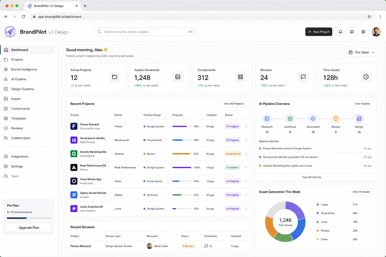
Clear-space and minimum-size rules above apply to every reproduction of the mark. Served read-only by BrandPilot. Tokens, previews and the agent prompt update in place when the owner publishes a new version.