Lumio
Design system lumio-brand · v1.0.0 · published 30/09/2026
Foundation
The brand's rules - philosophy, color and type tokens, usage guidelines - defined once on the design system.
Lit Ledger is for store operators who must know exactly what will leave their account before it leaves: every screen that can lead to a send shows its state, its gate and who approved it, in English and Vietnamese at equal weight.
It holds that trust comes from legibility, not persuasion, so a single indigo hue marks the one action that matters, everything else sits on zinc, and red means an error and nothing else. Any screen that needs a gradient, a countdown or a color-only signal to make its point is outside this system.
--Approval Violet
#512EFF / #917AFF
Reserved for the approval-check motif (a Lucide check inside a rounded square) on the approval queue, the pre-send gate and marketing pages; at most one per view. 6.32:1 on Ledger Paper; dark lifted to hsl(250 100% 74%) for 5.43:1 on Night Card. Never a button fill or a status color.
On white AA 6.5:1 · On dark Fail 2.6:1
--Approval Wash
#F2F2FD / #1C1B37
Selected table rows, the approved row in the approval queue and the active language pane. Always paired with a text label and icon; Ink reads 15.94:1 on it in light mode and Ledger Paper text 15.95:1 in dark mode.
On white Fail 1.1:1 · On dark AAA 15.9:1
--Attention Amber
#B45309 / #FBBF24
An action the owner must take before a send can proceed, such as a DNS record not yet detected. Never for warmup holds, which are neutral protection. Always with an icon and a word (4.81:1 light, 10.61:1 dark).
On white AA 5.0:1 · On dark AA large 3.5:1
--Card White
#FFFFFF / #18181B
Cards, popovers, product-screen frames and table bodies. Dark Night Card zinc 900 so elevated surfaces separate from the canvas without shadows.
On white Fail 1.0:1 · On dark AAA 17.7:1
--Chart 1
#737DD3 / #737DD3
Primary series: segment sizes and contact counts over time. From the approved palette, mode-stable: 3.64:1 or more on Card White and 4.54:1 or more on Night Card. Charts always carry direct labels or a legend with values, never color alone.
On white AA large 3.7:1 · On dark AA 4.7:1
--Chart 2
#AA6AB4 / #AA6AB4
Second series, e.g. a second engagement band. From the approved palette, mode-stable: 3.64:1 or more on Card White and 4.54:1 or more on Night Card. Charts always carry direct labels or a legend with values, never color alone.
On white AA large 3.8:1 · On dark AA 4.5:1
--Chart 3
#C66179 / #C66179
Third series. From the approved palette, mode-stable: 3.64:1 or more on Card White and 4.54:1 or more on Night Card. Charts always carry direct labels or a legend with values, never color alone.
On white AA large 3.8:1 · On dark AA 4.5:1
--Chart 4
#C26D32 / #C26D32
Fourth series. From the approved palette, mode-stable: 3.64:1 or more on Card White and 4.54:1 or more on Night Card. Charts always carry direct labels or a legend with values, never color alone.
On white AA large 3.7:1 · On dark AA 4.6:1
--Chart 5
#9C8500 / #9C8500
Fifth series; beyond five, group into "Other" in Graphite Note. From the approved palette, mode-stable: 3.64:1 or more on Card White and 4.54:1 or more on Night Card. Charts always carry direct labels or a legend with values, never color alone.
On white AA large 3.6:1 · On dark AA 4.8:1
--Error Red
#DC2626 / #F87171
Errors only: failed DKIM, SPF or DMARC records, hard failures and destructive confirmations. Always with an alert icon and a word. Light fill carries white text (4.83:1); dark mode lifts to red 400 with Night Desk text (7.19:1).
On white AA 4.8:1 · On dark AA large 3.6:1
--Field Edge
#808089 / #71717A
Input, select and checkbox boundaries, which must be perceivable on their own: 3.91:1 on Card White, 4.12:1 on Night Desk and 3.67:1 on Night Card.
On white AA large 3.9:1 · On dark AA 4.5:1
--Graphite Note
#71717A / #A1A1AA
Helper text, timestamps and captions on page and card surfaces (4.63:1 on Ledger Paper, 4.83:1 on Card White; dark 7.76:1 and 6.91:1). On Zinc Wash fills use Graphite Strong for text.
On white AA 4.8:1 · On dark AA large 3.6:1
--Graphite Strong
#52525B / #D4D4D8
Text and icons inside neutral status chips on Zinc Wash (7.03:1 light, 10.08:1 dark): paused by warmup, awaiting approval, draft, out of date. Neutral states never borrow red or amber.
On white AAA 7.7:1 · On dark Fail 2.2:1
--Indigo Muted
#D8D6F5 / #302E56
Border of a selected row or pane and the track of a selected toggle. Decorative edge only, never text.
On white Fail 1.4:1 · On dark AAA 12.5:1
--Indigo Pressed
#3229E0 / #544CE6
Hover and pressed state of the primary button. Darker in both modes so the white label keeps contrast (8.30:1 light, 5.91:1 dark).
On white AAA 8.3:1 · On dark Fail 2.1:1
--Indigo Text
#5048E5 / #8782ED
Links, inline indigo labels, the active nav label and indigo icons. Light 5.92:1 on Ledger Paper; dark lifted to hsl(243 75% 72%) for 6.11:1 on Night Desk and 5.44:1 on Night Card, because Lumio Indigo dark fill reads only 4.33:1 as text.
On white AA 6.1:1 · On dark Fail 2.8:1
--Info Indigo
#5048E5 / #8782ED
Informational notes and the scheduled state, with an info or clock icon and a word. Same hue as the brand so information never introduces a second accent.
On white AA 6.1:1 · On dark Fail 2.8:1
--Ink
#18181B / #FAFAFA
Body text, headings and tabular figures. Near-black zinc 900 in light mode, zinc 50 in dark mode.
On white AAA 17.7:1 · On dark Fail 1.0:1
--Ledger Paper
#FAFAFA / #09090B
Page canvas. Light zinc 50, dark Night Desk zinc 950. Light values sit on:root, dark under.dark.
On white Fail 1.0:1 · On dark AAA 16.9:1
--Lumio Indigo
#5048E5 / #6A63E9
The one primary action per screen region (filled button), the active nav item and the selected language tab. Light hsl(243 75% 59%), dark hsl(243 75% 65%) per the brand base. White label text passes in both modes (6.18:1 light, 4.59:1 dark). Fill only in dark mode; for indigo text on dark grounds use Indigo Text.
On white AA 6.1:1 · On dark Fail 2.8:1
--Periwinkle Rule
#747DE9 / #838CEC
Non-text strokes only: the thin annotation callout line on product screens, the active connector in the flow builder and focus-adjacent outlines. 3.44:1 on Ledger Paper meets the 3:1 graphical minimum; never used as text in light mode.
On white AA large 3.5:1 · On dark AA 4.9:1
--Ruled Line
#E4E4E7 / #27272A
Table row dividers, card edges and section rules. Quiet ledger lines, decorative only.
On white Fail 1.2:1 · On dark AAA 13.9:1
--Verified Green
#15803D / #4ADE80
Confirmed checks: a passing authentication record, a sent campaign. Always with a check icon and a word (4.81:1 on Ledger Paper, 10.17:1 on Night Card).
On white AA 5.0:1 · On dark AA large 3.5:1
--Zinc Wash
#F4F4F5 / #27272A
Muted, secondary and accent (shadcn meaning) surfaces: neutral chips, hovered rows, secondary buttons, the pre-send checklist panel.
On white Fail 1.0:1 · On dark AAA 16.1:1
heading
"Manrope", ui-sans-serif, system-ui, -apple-system, "Segoe UI", Roboto, "Helvetica Neue", Arial, "Noto Sans", sans-serif
primary
"Inter", ui-sans-serif, system-ui, -apple-system, "Segoe UI", Roboto, "Helvetica Neue", Arial, "Noto Sans", sans-serif
Scale
Durations
Easings
Hover
Avoid
Subjects
Treatment
Do
Dont
Traits
Example Lines
Color
Layout
Motion
Status
Typography
Identity
How the brand looks in practice - logos, imagery and artwork produced by its current design.
Shown from Lumio · v1.0.0

Lumio Logo
logo icon · 1024×1024

Lumio Logo Light
logo icon · iconLight · 512×512
Lumio Logo Dark
logo icon · iconDark · 512×512

Lumio Logo Monochrome
logo icon · iconMono · 512×512

Lumio Logo Reversed
logo icon · iconReversed · 512×512

Lumio Wordmark
logo wordmark · wordmark · 1024×256

Lumio Wordmark Light
logo wordmark · wordmarkLight · 1024×256

Lumio Wordmark Dark
logo wordmark · wordmarkDark · 1024×256

Lumio Wordmark Monochrome
logo wordmark · wordmarkMono · 1024×256

Lumio Horizontal
logo horizontal · horizontal · 1536×512

Lumio Horizontal Light
logo horizontal · horizontalLight · 1536×512

Lumio Horizontal Dark
logo horizontal · horizontalDark · 1536×512

Lumio Horizontal Monochrome
logo horizontal · horizontalMono · 1536×512

lumio-favicon
favicon · 32×32

Brand Imagery Background Texture
marketing image · 1536×1024

Brand Imagery Feature Vignette 2
marketing image · 1365×1024

Brand Imagery Feature Vignette 1
marketing image · 1365×1024

Brand Imagery Hero Scene
marketing image · 1536×864

Brand Imagery Social Proof
marketing image · 1024×1024
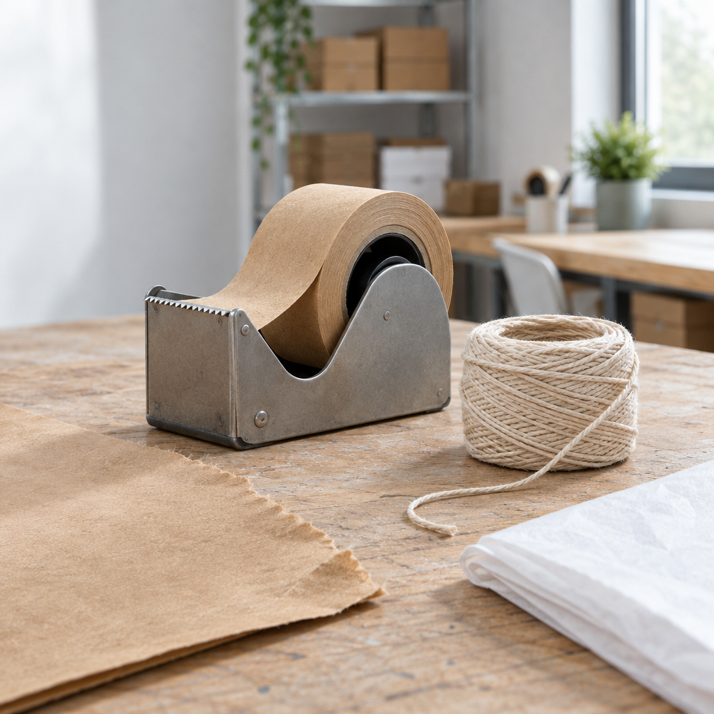
Brand Imagery Detail
marketing image · 1024×1024
Served read-only by BrandPilot. Tokens, previews and the agent prompt update in place when the owner publishes a new version.