TokyoCRM
Design system tokyocrm · v1.0.0 · published 28/09/2026
Foundation
The brand's rules - philosophy, color and type tokens, usage guidelines - defined once on the design system.
Sumi Ledger is a foundation for enterprise software that treats Japanese data and Japanese business practice as the native case, not a localisation layer: names always travel with their readings, every stored text keeps its original language, and approvals and the April to March fiscal year are structural elements rather than add-ons.
It takes a formal, quiet stance: a warm paper surface, ink-dark text and one deep pine hue that carries identity and action, so the data and the typography do the talking instead of mascots, gradients or banner stacks.
If a screen needs a second brand colour or a decorative motif to feel finished, it is off-system.
--card
#FFFFFF / #1B1F1E
Cards, tables, forms, popovers. The Paper to Card step separates panels instead of shadows.
On white Fail 1.0:1 · On dark AAA 16.6:1
--chart-1
#009F7D / #009F7D
Series 1 in charts and forecast bars (approved palette, mode-stable). 3.1:1+ on Paper and 5.43:1 on the dark page as a graphic; values always labelled.
On white AA large 3.3:1 · On dark AA 4.9:1
--chart-2
#0098B9 / #0098B9
Series 2 (approved palette, mode-stable). 3.39:1 on Card, 5.38:1 dark.
On white AA large 3.3:1 · On dark AA 4.9:1
--chart-3
#5A84D4 / #5A84D4
Series 3 (approved palette, mode-stable). Data only, never a UI or brand colour. 3.69:1 on Card, 4.94:1 dark.
On white AA large 3.6:1 · On dark AA 4.5:1
--chart-4
#9B6FC3 / #9B6FC3
Series 4 (approved palette, mode-stable). 3.85:1 on Card, 4.74:1 dark.
On white AA large 3.8:1 · On dark AA large 4.3:1
--chart-5
#C0628E / #C0628E
Series 5 (approved palette, mode-stable). 3.90:1 on Card, 4.67:1 dark.
On white AA large 3.9:1 · On dark AA large 4.2:1
--deep-pine
#00533E / #6CC2A5
Highlight role, reserved for the single most important element per view (for example the one decisive CTA on a marketing section or the approve action in a ringi step). White text on it light; Ink-dark text on the dark value (8.60:1).
On white AAA 9.1:1 · On dark Fail 1.8:1
--deep-pine-tint
#DCEFE8 / #173A30
Quiet background behind the one highlighted element (for example the recommended inline AI suggestion awaiting acceptance). Surface only.
On white Fail 1.1:1 · On dark AAA 13.9:1
--hairline
#DAD8D1 / #333A38
Decorative borders, table row rules and dividers. Thin hairlines replace heavy chrome.
On white Fail 1.4:1 · On dark AAA 11.6:1
--hover-surface
#E7ECE9 / #22302B
shadcn accent surface: hover state of menu items, rows and ghost buttons, a faint pine-tinted neutral (Ink text 13.93:1).
On white Fail 1.1:1 · On dark AAA 13.9:1
--info
#3D5F78 / #8DB4D3
Neutral informational notices (sync notes, calendar reminders). A deep desaturated slate, not a category brand blue. 6.25:1 on Paper; dark 8.34:1.
On white AA 6.7:1 · On dark Fail 2.4:1
--ink
#1B1F1E / #EDECE7
Foreground text, headings and kanji in dense tables. 15.40:1 on Paper; dark foreground 15.42:1 on the dark page.
On white AAA 16.6:1 · On dark Fail 1.0:1
--input-border
#878C89 / #6A716E
Form field outlines and checkbox/radio boundaries, where WCAG non-text contrast needs 3:1 (3.42:1 on Card, 3.16:1 on Paper; dark 3.33:1 on Card).
On white AA large 3.4:1 · On dark AA 4.8:1
--muted-surface
#EFEEE9 / #232827
Muted backgrounds: table header rows, disabled fields, secondary buttons, code and record-ID chips.
On white Fail 1.1:1 · On dark AAA 14.3:1
--paper
#F7F6F2 / #121615
Page background. Canonical light mode sits on:root; the dark peer is a near-black with a faint pine undertone under.dark.
On white Fail 1.0:1 · On dark AAA 15.3:1
--pine
#1F4D40 / #84B8A6
Brand identity, primary buttons, links, focus ring and the active step of an approval chain. Light: white text on Pine (9.57:1); Pine as text on Paper 8.85:1. Dark: a lighter step of the same pine hue carrying Ink-dark text (8.15:1), never a brighter blue-green. Keep under roughly one tenth of any screen.
On white AAA 9.5:1 · On dark Fail 1.7:1
--pine-hover
#173B31 / #9CC8B8
Hover and pressed state for Pine buttons and links.
On white AAA 12.3:1 · On dark Fail 1.3:1
--pine-mist
#4E6C62 / #9DB5AC
Approved secondary role. Selection marks, the active JA / EN segment of the language switch and fiscal-season band labels (year-end rush, Golden Week, Obon). Holds 5.33:1 on Paper and 5.76:1 on Card as text; dark 8.37:1 on the dark page.
On white AA 5.7:1 · On dark Fail 2.8:1
--pine-mist-tint
#E6ECE9 / #243029
Fill of fiscal-season bands on forecast timelines and the inactive track of the approval stepper. Surface only; labels on it use Ink or Pine Mist.
On white Fail 1.1:1 · On dark AAA 13.9:1
--pine-tint
#E3EDE9 / #1C2D28
Selected rows, active navigation item background and focus-within panels. Ink text on it 13.92:1 light; Pine text on it 8.00:1 light, dark Pine on it 6.45:1. Surface only, never text.
On white Fail 1.1:1 · On dark AAA 13.9:1
--rust
#9C3B2B / #E48A76
Destructive and error states only, always with an icon and a label; never brand, fill decoration or paired with a large white field. White text on Rust 6.83:1; dark value carries dark text (7.12:1).
On white AA 6.8:1 · On dark Fail 2.4:1
--stone
#626865 / #A3AAA7
Muted text and the dedicated reading (furigana and romaji) style. 5.27:1 on Paper, 5.70:1 on Card, 4.90:1 on the muted surface; dark 7.70:1.
On white AA 5.6:1 · On dark Fail 2.9:1
--success
#2E6A3E / #7BC08D
Approved and completed states (ringi approved, sync complete), always with a check icon and label. 5.98:1 on Paper; dark 8.48:1.
On white AA 6.4:1 · On dark Fail 2.5:1
--warning
#8A5A00 / #E0B050
Pending and attention states (approval pending, low-confidence meishi field), with an icon and label. Deep amber holds 5.48:1 on Paper; the dark value 9.12:1 on the dark page.
On white AA 5.9:1 · On dark Fail 2.8:1
heading
"Shippori Mincho", "Hiragino Sans", "Hiragino Kaku Gothic ProN", "Yu Gothic UI", "Yu Gothic", Meiryo, "Noto Sans JP", system-ui, -apple-system, "Segoe UI", sans-serif
primary
"IBM Plex Sans JP", "Hiragino Sans", "Hiragino Kaku Gothic ProN", "Yu Gothic UI", "Yu Gothic", Meiryo, "Noto Sans JP", system-ui, -apple-system, "Segoe UI", sans-serif
Scale
Durations
Easings
Hover
Avoid
Treatment
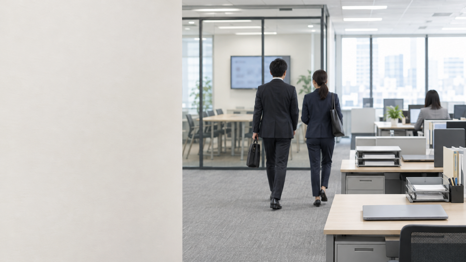
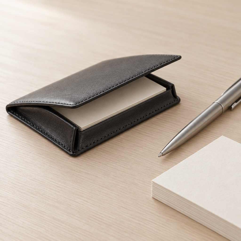
Calm, even light and neutral colour grading on Paper-toned backgrounds; product screenshots framed with hairline borders and generous whitespace; diagrams in Ink and Pine only; every sample name and figure in UI imagery is a neutral placeholder marked illustrative.
Primary Subject
Real product UI as proof: reading-aware search results with furigana shown, per-field JA / EN badges, the approval chain stepper, fiscal-year forecast bands and the meishi capture and review screen.
Secondary Subjects
Do
Dont
Traits
Example Lines
Language Order
Japanese first in polite keigo, English second in plain, precise sentences; each language written natively, not translated word for word.
Components
Identity
How the brand looks in practice - logos, imagery and artwork produced by its current design.
Shown from TokyoCRM · v1.0.0


Brand Imagery Background Texture
marketing image · 1536×1024

Brand Imagery Feature Vignette 2
marketing image · 1365×1024
Brand Imagery Hero Scene
marketing image · 1536×864

Brand Imagery Feature Vignette 1
marketing image · 1365×1024

Brand Imagery Social Proof
marketing image · 1024×1024
Brand Imagery Detail
marketing image · 1024×1024
Served read-only by BrandPilot. Tokens, previews and the agent prompt update in place when the owner publishes a new version.